UI Design, Live Website
Rumo – Redesigning a Recommendation system Saas Website
Platform
Live Website
Timeline
2 Weeks, 2022
Tools
Figma
My Role & Team
As the UI/UX designer, I worked closely with the Product Manager and UX Researcher
RUMO is a B2B SaaS recommender system designed to simplify personalized recommendations for businesses in creative industries. It's a branch of Spideo, a well-known recommender system based in Paris, initially focused on TV and video media. However, RUMO wants to broadens its scope to cater to companies of all sizes across various creative sectors, not just limited to video.
Who are the users?
The target users are business owners who are interested in technological and practical solutions that enable them to bridge the gap between media consumption and user preferences. They crave for a simple and effective tool that allows them to manage media recommendations seamlessly.
Rumo had a straightforward vision and mission: to offer businesses an ethical and transparent recommendation algorithm that's easily customizable. However, the existing website left some users uncertain about Rumo's offerings and its potential value, leading to skepticism and a low adoption rate.
My Task
To redesign Rumo's website, my goal was to make it informative and persuasive, clearly communicating its value proposition. This involved giving it a fresh appearance that aligns with its updated visual identity and strategically reorganizing information to enhance the overall user experience.
Their current website can be considered empty as it lacks substantial information about Rumo’s product. There was not much product visualization, technology and feature descriptions. the users thought the website was too abstract, inconsistent, lacked concrete information and hence not convincing. Call to action buttons were unclear and the hierarchy of information was confusing.
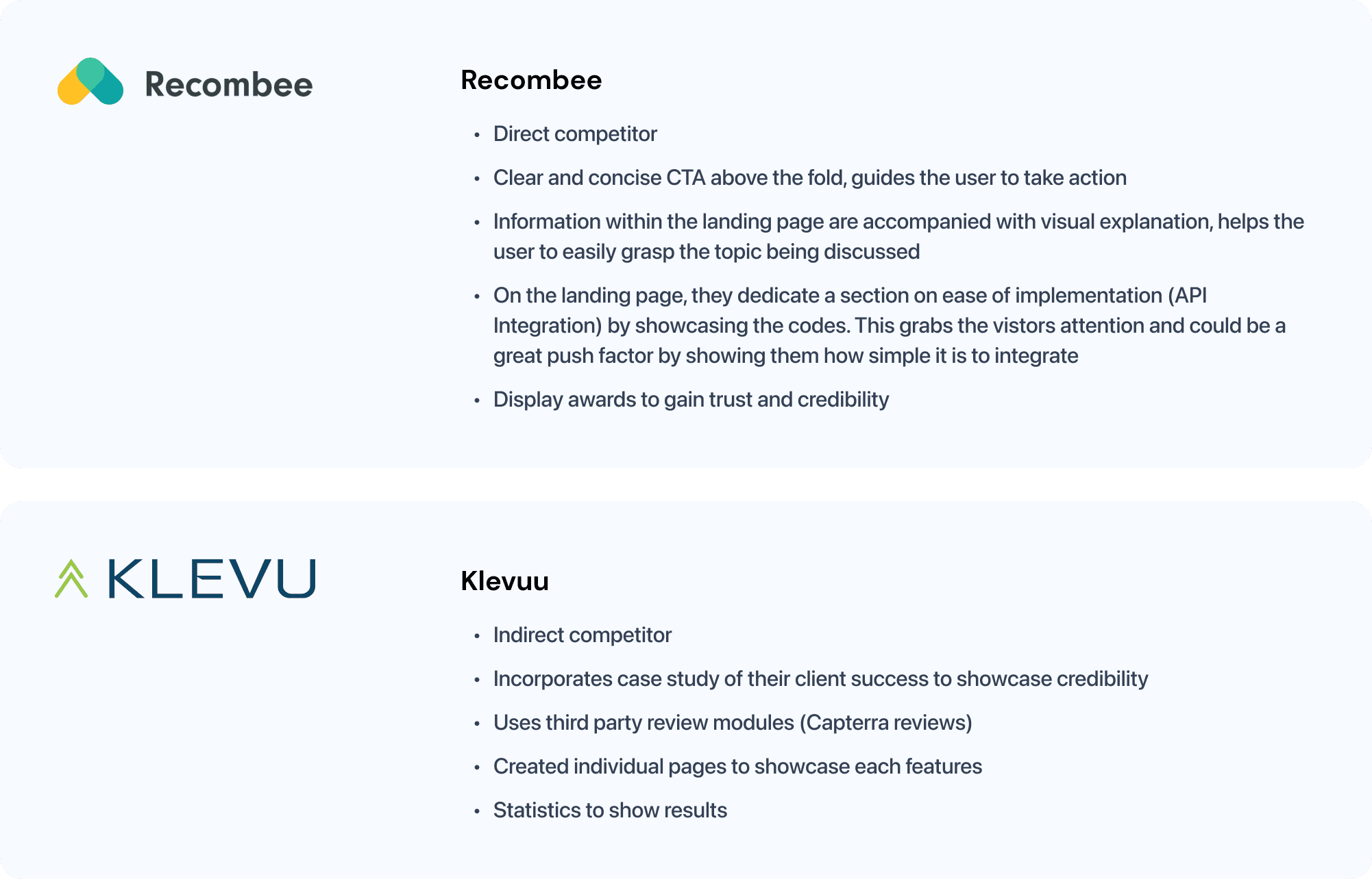
Before moving ahead with the high-fidelity design, I did a brief competitor research to help me understand the market, get inspirations from and familiarize myself with Saas website best practices that convert.
Amidst time and budget limitations, Rumo provided me with a (usability) tested wireframe of the desired sections and page layout.
Feedback on the Wireframe's usability test included:
Excessive text
Unclear value proposition
Not visually appealing
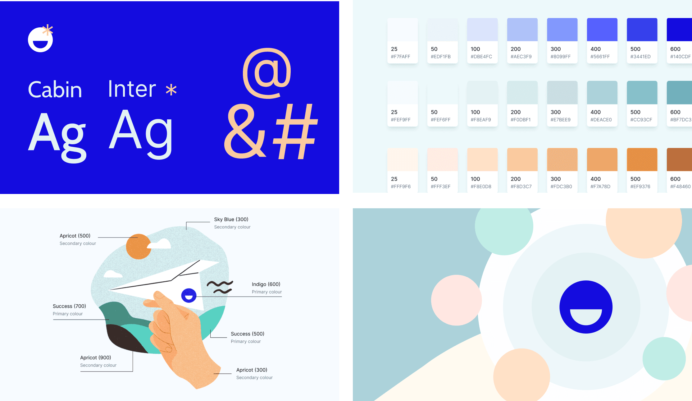
Rumo aims to be a user-friendly tool that gives users the power to use its algorithm effectively. We want to make the website experience more modern and enjoyable by using warmer colors, geometric typography, and adding fluid shapes and patterns, reflecting Rumo's commitment to transparency and showcasing how the algorithm works.
Homepage
After looking at the wireframe, I realized the homepage needed more clarity. It should not only explain the benefits of the product but also show how it solves users' problems. Since the homepage is the first thing users see, it needs to be engaging and convincing. This is where visuals, animations, and clear writing come in handy.
Applying the AIDA model
To make the homepage more effective in turning visitors into users, I used the AIDA model. It breaks down the customer's journey into Awareness, Interest, Desire, and Action. As one of the main KPI of this project was to increase adoption rate, utilizing this model helped me restructure the page into one that supports the user's usage and purchase decision.
Key Improvements to the Homepage
Clear and concise summary of the product’s value proposition & main features.
Written in a way that it solves the user’s pain points so that users don’t need to browse through the whole site.
Usage of animations to showcase the industries served by Rumo instead of listing them out.
Captivates user attention and improves the overall look & feel to match with the new branding.Incorporating links to Features or How it Works within different sections of a page.
This would improve flow between the existing site while promoting a deeper understanding of the product.Placed the main CTA (Book a demo call) at multiple places within the page.
In order to get more conversions. I placed them at the sticky nav bar for easy access, statistics section and one final CTA before the footer
2. How It Works page
The old website lacked details on how Rumo operates. To uphold Rumo's commitment to transparency, we added a new page to explain the technology behind Rumo's algorithm and how easily it integrates with other tools.
Previously, the demo video was buried in the contact page, which wasn't ideal. By adding the demo video and FAQ to the "How It Works" page, users can now better understand complex topics like algorithms and recommendation engines, ultimately helping increase product adoption.
3. Features Page
Originally named "Why Rumo," the page's content focused on describing Rumo's features. To align the title with the page's content and make it easier for users to find, I suggested renaming it to "Features." This change provides a straightforward way for users to access information about what Rumo offers.
Our users struggled to understand the product's functionality, so this page was crucial. It presents all of Rumo's features, accompanied by visuals derived from the product. Each section illustrates how the recommendations appear in various industries, aiding users in understanding how Rumo can benefit their businesses.
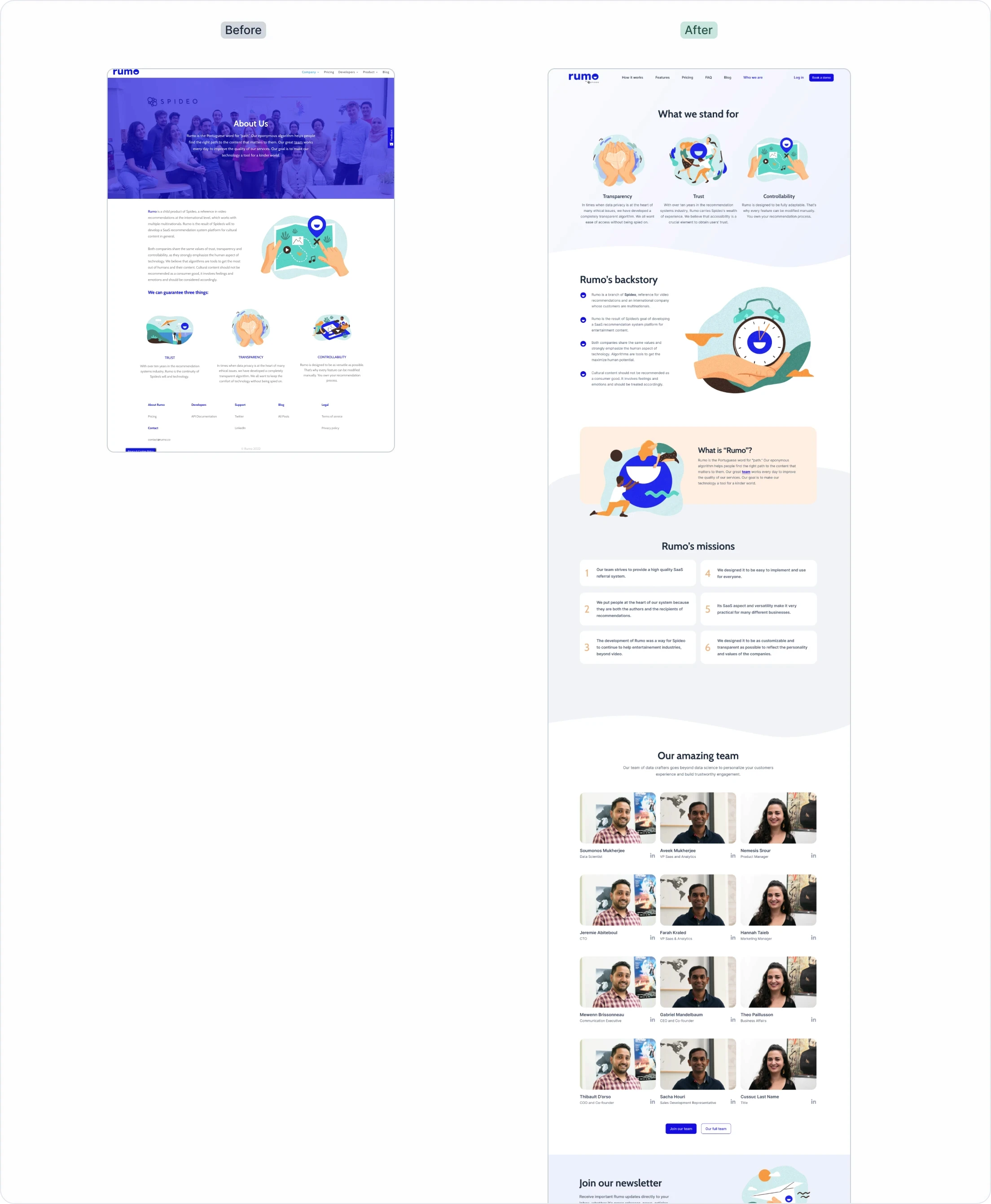
Who We Are Page
Given the text-heavy nature of this page, I aimed to make it more engaging by breaking down lengthy paragraphs into bite-sized pieces and adding more graphics.
Increased Conversion and Lead Generation
Strategic changes, including optimized call-to-action placements and content restructuring, led to a 28% increase in lead generation for demo requests.
Enhanced Credibility and User Confidence
The redesign made Rumo's value proposition clearer and more accessible, significantly boosting the product's credibility and user confidence.
Getting positive feedback from users and stakeholders highlighted the importance of a great first impression. A well-designed and user-friendly website greatly increases the likelihood of encouraging people to take action.
Despite tight time and budget constraints, using components from our Rumo Design System sped up the design process. As we move forward, we know there are areas to improve, like responsiveness and accessibility. We plan to share success stories to build trust as we gather feedback and keep refining our user experience.
Scroll to top


