UI/UX Design, Web App
Rumo – Recommendation Preview Feature
Platform
Web App
Timeline
3 Weeks, 2021
Tools
Figma & Miro
My Role & Team
As the UI/UX designer, I worked closely with the Product Manager and UX Researcher
RUMO is a B2B SaaS recommender system designed to simplify personalized recommendations for businesses in creative industries. It's a branch of Spideo, a well-known recommender system based in Paris, initially focused on TV and video media. However, RUMO wants to broadens its scope to cater to companies of all sizes across various creative sectors, not just limited to video.
Who are the users?
RUMO users typically include founders, project managers, or analysts from media companies like video, music, and publications. They're often seeking a user-friendly solution for offering tailored recommendations to their customers, without needing deep technical expertise.
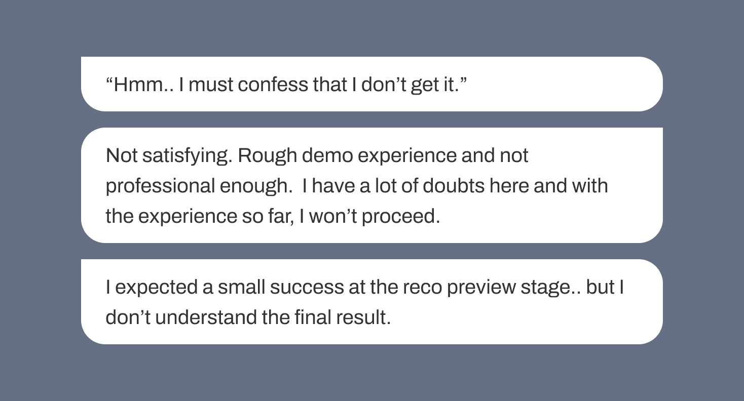
Initially, RUMO lacked an in-house UI designer when creating its MVP. Therefore, the product screens appeared unpolished, inconsistent, and not very user-friendly. As they're in the phase of demonstrating the product, they recognized the need for a UI/UX overhaul to boost confidence in capturing leads, showcasing the product in demos and prospect calls, and ultimately, closing deals.
My Task
The recommendation preview function is pivotal in helping users grasp how recommendations will appear to their customers. My task is to redesign the feature to make a strong first impression on potential clients. The current design lacks polish and falls short in terms of user-friendliness.
To clearly understand the needs and pain points of RUMO’s users, I synthesized the existing research findings conducted by RUMO’s internal team, by breaking down the main points into two categories, user needs and pain points.
Unpolished and Unfriendly UI: The interface lacks polish and isn't intuitive for users.
Scrolling Required for Full Screen View: Users need to scroll excessively to see the entire screen, disrupting the user experience.
Lack of Page Functionality Explanation: Users struggle to understand how the page functions due to inadequate explanations.
Confusing Score Concept: Users find it challenging to grasp the concept of scores, including how they are calculated and why lower scores indicate higher similarity.
Inconsistency in UI Design: The interface lacks consistency, leading to confusion and disjointed user experiences.
Unclear Integration Instructions: Users are unsure how to integrate the system into their own websites due to unclear instructions.
Overall Negative User Experience: Users report feelings of disappointment, frustration, and confusion, leading to a lack of confidence and conviction in the product.
Taking these problems, i tried to reframe them into a “How Might We” question as it frames the challenges into opportunities for design. It helps to set myself in the right mindset for creative and innovative thinking.
Next up, I did a UX audit on their current design to pick up on current issues and what can be improved. I took a screenshot of the current screen and used Miro (a whiteboarding tool) to comment on the areas that needs improvement.
Given the brief and functional specs (provided by RUMO’s internal team) I had clear direction on how to move forward. As we started working on a tight deadline, I did a quick sketch on the layout placement and immidiately started digitizing on Figma.
The stylization of the propotype is adapted from Rumo’s existing style guide and brand colours.
With the feedback gathered from stakeholders as well as the usability test conducted by RUMO’s UX Researcher, here are the topics that we arrived for areas for improvement.
1. Improving cognitive load.
Users feel overwhelmed by the amount of information on the page. Prioritize essential information, remove unnecessary details, and reorganize the layout for clarity.

2. Changing recommendation score visualization.
The recommendation score system is confusing. Modify the visualization to represent similarity more intuitively, possibly using a linear scale where 0 means closer and 1 means further away.

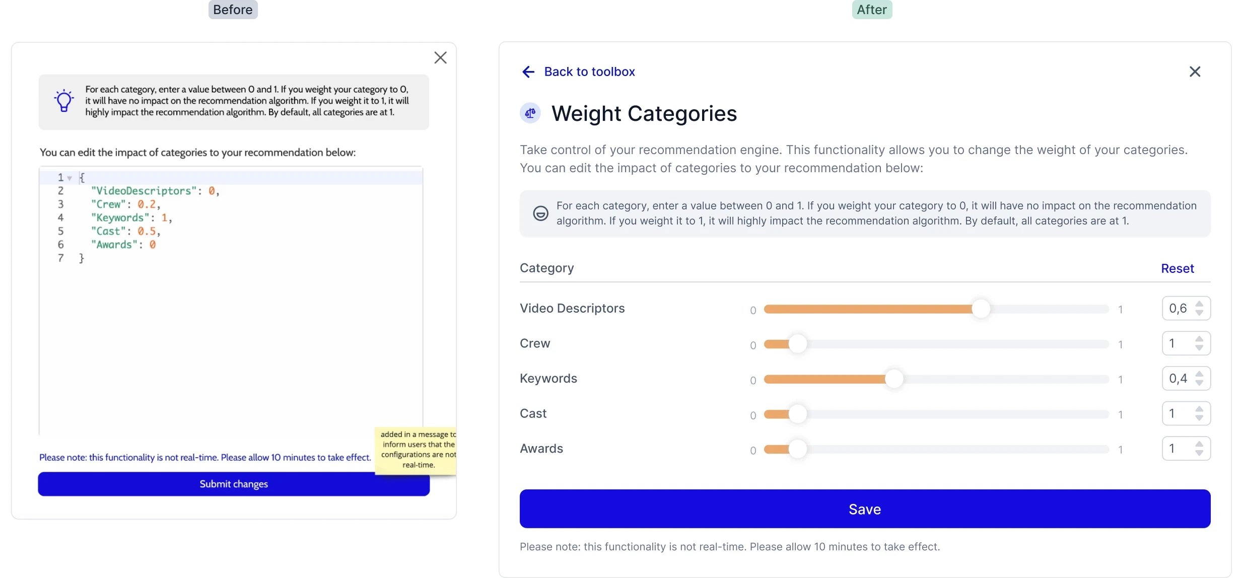
3. Improving weight configurations pop up.
The tool for adjusting weight configurations is currently complex and intimidating. Simplify it by replacing technical elements with user-friendly options, like sliders for setting category weights.
Global Change to Typography and Color Usage
I changed the font from "Cabin" to "Inter" for a more modern and polished look. This makes Rumo feel more experienced and enjoyable to use.
For the side-navigation bar, I made it less overpowering by adjusting the color balance. Now, the focus is on the functionalities on the right side of the page. I used the 60% - 30% - 10% rule:
60% is white for space and clarity.
30% is a lighter shade of the primary color (Indigo) for balance.
10% is the accent color (Indigo) for important elements like buttons or CTAs.
This creates a more balanced and user-friendly interface.
2. Using a Distance Notion to Indicate Recommendation Score Between Contents
A linear visualization to indicate distance (or should we say similarity) between each content. Labels help users understand what content is being compared.
3. Collapsible Block
Hierarchy and placement of elements plays a huge role in creating a systemic flow within a page. The collapsible blocks helps users focus on a task one step at a time, reducing page length and cognitive load.
Improved Weight Configurations Function
Using simple UI elements, such as a slider to change the weight of an element, can be easily understood by our users. By providing a limitation on how far the numbers could go, could also decrease the margin of error.
RUMO is in a phase of having to showcase the product more; the redesign made them confident in capturing leads when showcasing the product for public demos and prospect calls. The new UI style received much positive feedback from stakeholders, and also made a great impression among their customers. They appreciated my focus on users and my ability to deliver top-notch prototypes quickly. This resulted on a lasting relationship with RUMO’s team. The redesign of the feature has also improved customer satisfaction by 35% and received positive feedbacks from stakeholders and users.
The metadata and recommendation API can be tricky to grasp, and I initially found them intimidating. However, I turned this challenge into an opportunity to better understand the users' perspective, which fueled my motivation to solve their problem.
To tackle this, I delved into the technical documentation, ensuring I had a solid understanding of how each feature worked. Open communication with RUMO's team and a curious mindset also played a key role in avoiding misunderstandings. I want to express my gratitude to Nemesis & Farah for their clear documentation and helpful clarifications.


