UI/UX Design, Web App
Lyte for Freelancers Dashboard Redesign
Platform
Web App
Timeline
2 Months
Tools
Figma
My Role & Team
As the UI/UX designer, I worked closely with a design lead, a product owner, and a product marketer.
Lyte for Freelancers is a B2C invoicing platform designed to help freelancers create and send invoices, track payments, and receive reminders for overdue payments. It offers cash rewards on sent invoices through its Boost feature, providing freelancers with financial incentives after completing the selected commitment period.
Partnership Opportunity
With the upcoming Freelancer Agency partnership, which anticipates onboarding 200-300 new users, we wanted to ensure a smooth user experience for a positive product perception and prolonged, continued usage.
A business opportunity arising from the partnership was for Lyte to develop an 'Advance' feature, where commission advances were to be offered to the agency Freelancers.
My Task
Redesign and enhance the usability and user experience of Lyte for an upcoming partnership with a Singapore-based freelancer agency.
Our freelancer users primarily utilize our platform for sending invoices to clients, with growing interest in our Boost feature. However, our UI suffers from a lack of intuitiveness, particularly concerning Boost, resulting in user confusion and hesitancy to engage with the feature. This uncertainty undermines overall user satisfaction and hinders the full utilization of our platform's capabilities.
Phase 1:
To start off, I conducted a comprehensive audit of the dashboard pages, noting areas for improvement using Jakob Nielsen’s heuristic analysis principles. Our design principle is to embrace simplicity so we are focused in finding inconsistencies and redundancy of elements.
Phase 2:
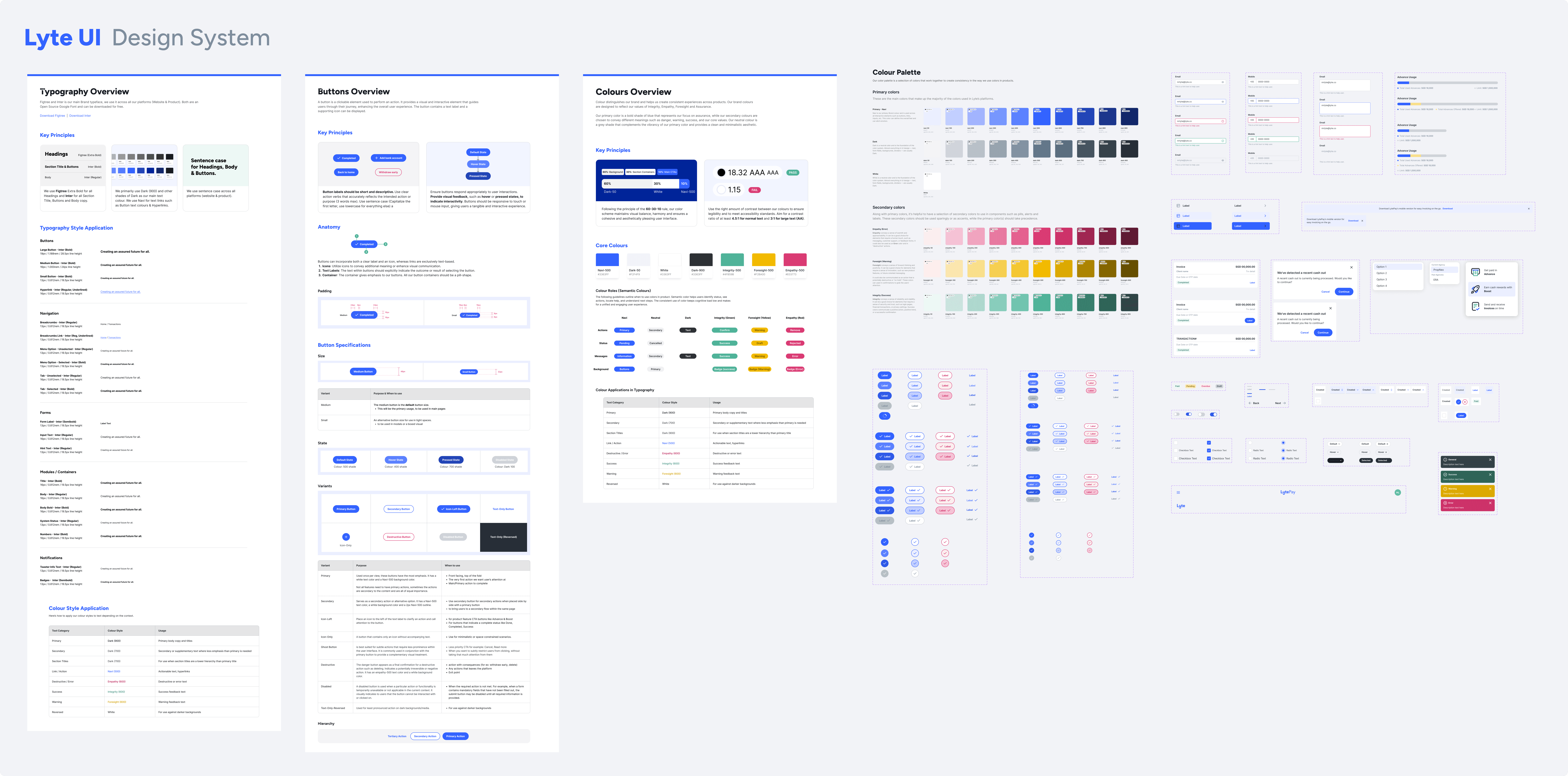
Our freelancer app lacked a consistent design system, leading to a messy and disjointed user experience. To enhance product and brand perception and build trust, I along with the design Lead created Lyte UI, a design system that ensures consistency and clarity across all products.
This streamlines development and offers a smoother user experience. Now, both our core products; Lyte for Freelancers and Lyte for Property Agents feel cohesive and professional.
Phase 3:
Insights Gathered
Users expressed challenges with unstable income, particularly from high-ticket clients with slow payment processes.
Interest in the Boost feature was high, but skepticism arose from its complicated language and lack of clarity.
Feedback revealed redundant sections on the homepage and inconsistent components impacted overall user experience.
Issues with invoice creation page included the inability to create line items without assigning a price, resulting in long and cumbersome invoices.
Users also disliked displaying their home address on invoices without the option to remove it.
Desktop was the preferred platform for administrative tasks, but some on-the-go freelancers found the mobile experience lacking due to challenges with table views.
The Investor Minded
High-risk appetite; interested in using Boost rates for high rewards.
The Practical
Utilizes Lyte for its practicality and ability to manage administrative tasks efficiently.
The Income-Fluid
Experience inconsistent income and seek streamlined tools.
Opportunities
Improving the invoice and Boost experience will make users more confident in using Boost, increasing Income Under Management (IUM). Satisfied freelancers may recommend Lyte to others, growing our user base through word-of-mouth.
The research validated the value of the new "Advance" feature introduced through the partnership. This commission advancement service is expected to help freelancers manage unstable income.
Phase 4:
Alongside the Design Lead, Product Owner and researcher, we prioritized tasks based on insights from user research. We targeted quick wins to maximize value within our time and resource constraints, focusing on high-impact, low-effort issues.
Project Constraint
Due to tight timelines and limited resources, usability testing opportunities were limited. We resorted to asking freelance employees within the company to review improvements and provide feedback.
Phase 5:
Guided Tour for Homepage and Boost
Introduced a replay-able guided tour early in the user journey to provide guidance for using Lyte and address user confusion with Boost feature.
2. Homepage Improvements
Having a well designed homepage is important because it can make or break your user's first impression. We removed unnecessary clutter and simplified the homepage for clearer presentation of important information about invoices and Boost performance.
3. Clearer Boost pages
Boost Settings page
We revamped the Boost settings page to provide clear, informative content, helping users understand and trust the Boost feature. This redesign simplifies the concept and allows users to easily visualize potential rewards.
Boost Summary page
We refined the Boost summary page to better align the boost statistics with users' language and added a individual details page to give additional context of each Boost beyond the limits of a standard table.
Enhanced Invoice Pages
By allowing users to opt our of their home address, allowing them to format their itemized description and with the implementation of our new Lyte UI components, we’ve enhanced their user experience and the pages look more professional and visually consistent.
Improved Mobile Experience
We know tables can be challenging to navigate on mobile devices. To address this, we've switched to a card-based design for mobile users, enhancing clarity and making the experience more user-friendly.
The addition of the Advance Feature
Using the existing pages from our Commission Advance for Property Agent product as a base, we customise it to fit our freelancer audience and Advance mechanics.
To measure the success of the redesign, we'll focus on these key metrics:
User Retention: An increase in active users will show us how well the redesign is working.
More Boosted invoices: Tracking how many invoices users choose to Boost can reveal the redesign's impact on this feature.
Higher Customer Satisfaction (CSAT) Scores: User feedback will help us understand how happy people are with the new design.
Though the project is still in development and we can't measure these metrics yet, we're optimistic about the redesign. Feedback from the focus group preview suggests users like the clearer interface and improved visuals, giving us confidence in promoting the product.
Being exposed to time and development resources constraints necessitates in creating efficient, realistic designs that can be implemented quickly.
Maintaining a good collaboration with the developers and POs are also needed to measure the feasibility of the designs. We need to keep a focus on what truly adds value to the user experience which in our case, is making sure our users gets enough clarity on our core features and eliminating usability issues that can lead to user abandonment.
For the next steps, we'll prioritize gathering more user feedback on both the launched design and features yet to be released. We'll use this feedback to continuously refine our designs and create better experiences for our users.
Scroll to top


